The best practices for eCommerce websites listed below will show you how to succeed with your online store and convert more visitors into customers. They would help you generate additional leads and increase your sales revenue as a result.
If your company sells physical goods, you’ll need a solid online presence.
However, considering the high competition within the eCommerce market, it can be difficult to stand out. You must compete not only with regional and local brands but also with global behemoths like Walmart and Amazon.
That is why it is important that you pay attention to every aspect of the eCommerce website.
You need to learn to build a conversion-focused homepage.
Everyone will benefit from this guide. These eCommerce guidelines will help you if you are a retailer with a physical presence venturing into the online world, a company operating solely via the Internet, or anything in between.
It doesn’t matter whether you’re creating a new store or making improvements to one you already have.
Best Practices For Ecommerce Websites In 2026
1. Make The Menus Easier To Understand
Menus are a perfect way to categorize what you are selling and stay organized. However, as previously said, do not overcomplicate stuff.
A menu with so many categories can confuse customers and make it difficult for them to find what they’re searching for.
You don’t need to be too specific about your menu. Instead, categorize the goods using general terms.
Let’s presume your eCommerce store offers clothing that includes things like:
- Sweatshirts
- tee shirts
- tank tops
- shirts with long sleeves
- vests
You can group these options into one category: “tops,” rather than offering five separate menu buttons for each option.
2. Get Rid Of Clutter
Conversion rates are higher in eCommerce stores with simple designs.
Examine your homepage. What is the first item that someone sees when they arrive?
There must be a distinct focal point. The visitor’s gaze should get drawn immediately to a call-to-action button or the items you sell.
However, a lot of clutter would make it hard to spot your call to action.
Only 47% of websites have CTAs that take visitors 3 seconds or less to find. You should strive for a faster time like that.
When people visit your website, what actions would you like them to take? We are obviously interested in them buying something.
Make it as simple as you can. Don’t get people distracted with clutter. It can be confusing and frustrating.
3. Work With A Reliable Web Hosting Provider
An important aspect of a good eCommerce website is its speed. To achieve high conversion rates, each page must load quickly.
However, if you purchase a low-cost web hosting service, it will cost you more over the long term.
According to research, a 1-second delay in page speed can result in a 7 percent drop in conversions and a 16 percent drop in user satisfaction. You’re in trouble if your website has a 2- or 3-second delay.
Site crashes, error reports, or bugs are much worse than slow page speed.
That’s why, rather than struggling with these issues later, you’re better off investing in a reliable web hosting package now. It’s well worth the money.
4. Have A Search Box
Let’s continue our discussion about simplicity.
You’ll need to make some more adjustments now that some clutter is cleared, and the menu options are simplified. Visitors will see more items when each category is clicked on and there will be fewer menu options.
I understand that some people don’t have a large number of items for sale on their website, but other online stores may have several options.
Making users browse through these options at random will not result in increased purchases or conversions. As a result, one of the best practices for eCommerce websites is to have a search box.
Take a look at this example from the Zappos website:
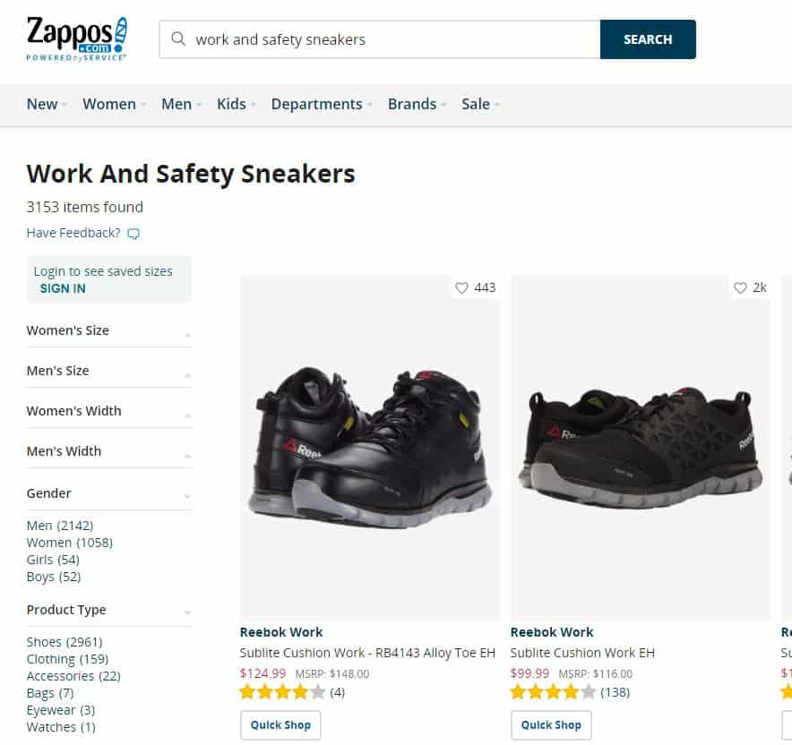
On its website, the company has listed thousands of pairs of shoes. Customers will be able to quickly locate what they’re searching for using a search bar.
In the example above, a search for “work and safety sneakers” yielded the following results. There are 3153 items that suit this definition. Even so, there are still a lot of things to browse through.
However, the Zappos search function has more filters in the column on the left.
This allows consumers to narrow down their choices based on criteria like sport or gender.
If this technique is used, make sure that all of your items are clearly labeled with the necessary labels. The search output would then be shown correctly for each shopper’s question.
5. Don’t Force Customers To Create An Account
You need your customers to complete the checkout process as soon as possible.
That is why, rather than requiring visitors to create an account, you should have an option to checkout as a guest.
Take a look at this Walmart example to see how they do it:
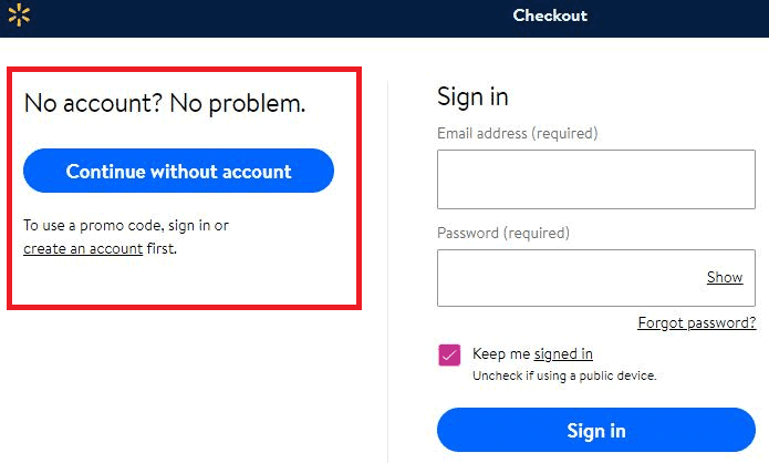
After adding items to the cart, shoppers can continue without creating an account to complete their purchase.
But that doesn’t rule out the possibility of Walmart encouraging users to create an account.
While reviewing the order, the guests could see a button for express checkout, without being able to use it. This choice is only available to customers who have created accounts.
Since all the information is stored in the created accounts, they can complete the checkout process much faster. Subtle options like this allow customers to create accounts without being intrusive or too pushy.
6. Reduce The Number Of Steps In The Checkout Process
When a website user wishes to purchase something, they must be able to finish the transaction quickly. It’s up to you to make that happen.
The likelihood of them leaving the transaction increases with every additional step in completing the checkout. Based on data, 28 percent of customers said they left a shopping cart before completing the checkout process because it was lengthy and difficult.
Therefore, one of the eCommerce best practices is to collect only the most important details from the customer.
There’s no need to inquire about their mother’s maiden name, their first concert, or their favorite vacation destination.
Obtain their billing and mailing addresses. You just need this information to complete a transaction.
7. Make SEO A Top Priority
Not everybody who is interested in what you have to offer will go directly to your site.
According to research, 46% of customers begin the purchasing process by using search engines like Google.
They’ll buy from your competitors if your online store isn’t on top of the search results. That is why you must concentrate on SEO.
Make every effort to rank higher on Google for searches relevant to the products or services your company offers.
8. Send Emails To Customers Who Abandoned Their Shopping Carts
You are able to tell when a user adds an item to their cart without purchasing it once they’ve set up their account. Don’t overlook this.
You’re missing an opportunity to follow up.
They might be just a few clicks away from finishing the transaction. They were clearly interested in buying the product because they added it to the shopping cart.
Following up with an email to remind them of the item may be enough to seal the deal.
9. Remove Advertisements
Some people could be selling advertising space on their eCommerce site to other businesses. It’s not a good idea and is a common mistake.
Sure, you might make some extra money. However, it is not worth it to direct your own customers to other websites.
Ads in the sidebar and popups may appear to be spam. A user might be hesitant to browse through the website for fear of being taken to a spammy website.
Think about how people feel about ads on sites around the world.
80 percent of Americans believe that online advertisements ruin their buying experience.
Design a webshop by getting rid of any advertisements you may have and try to leave the area blank. This will be helpful in removing the clutter from your design, as mentioned earlier.
10. Be Consistent With Your Blog Posts
How often would the same visitor come back to your eCommerce site?
They aren’t going to buy items every day. It is also unlikely to purchase something every week. Your most loyal customers might shop every month.
People who aren’t on your site are clearly not going to make a purchase.
However, having a blog in conjunction with your online store is a perfect way to grow your audience. People will now have a justification to visit your website on a regular basis.
They are more likely to purchase something while they’re on the website.
11. Building An Email List Of Subscribers
You need a lot of visitors ready to purchase in order to have a successful online store. But how do you plan to get people to visit your website?
One of your best choices is to build an email list. If you have an email address for a subscriber, you can reach out to them with exclusive deals and promotions.
Collecting email addresses at the time of checkout is a smart way to build the list. Here’s a good example from Adidas:
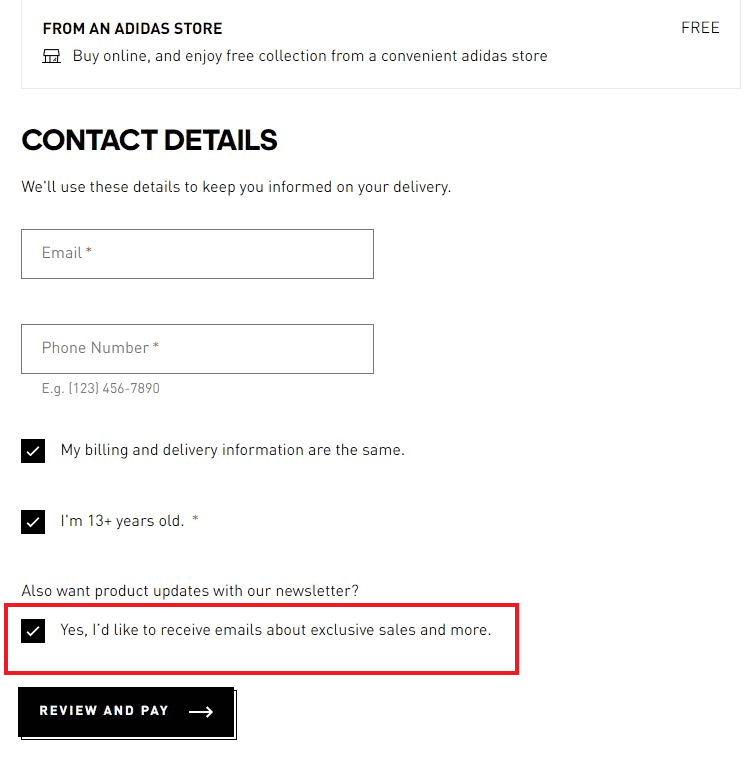
This checkbox is selected by default. If customers do not want to get added to the email list, they must deselect this option.
If people have been added to the list, you can send them exclusive offers in order to boost traffic to the store and sales.
You may also offer a discount on their next order to motivate customers to join the email list.
12. Accept Different Payment Methods
Not everybody has a MasterCard or Visa.
Even if this is the case, it does not imply that it is their preferred method of payment. It could be that there is no balance left on the card, or another card may provide better benefits for their membership.
Even though there are higher transaction fees for merchants by some card companies, one of the best practices for eCommerce websites is to accept credit cards such as American Express and Discover.
Alternative payment methods, such as Apple Pay and PayPal, must also be accepted in your eCommerce store.
13. Create Detailed Product Specifications
You can’t sell anything based solely on its name. A detailed overview of each item in your store is needed.
However, avoid broad descriptions to a minimum and keep the summaries brief.
Highlight the main benefits to describe the product functions. You don’t have to go over the product’s entire history or origin. That isn’t going to help you sell anything.
You can also utilize bullet points for helping customers to browse the summary and read the text more quickly.
14. Switch To Mobile
Mobile device optimization is needed for your online store.
This is because of the increasing percentage of smartphone users making online transactions.
You can’t afford to lose mobile customers. You may also want to consider developing an app for your eCommerce company if you would like to step up your mobile strategy.
It is the best way to personalize the shopping experience for the customer. You can also save user details, such as shipping addresses and payment options to your database.
Instead of having to enter their credit card information for each transaction, they can now complete the purchase process with just a few clicks.
15. Customer Service Should Be Readily Available
All of your eCommerce site’s transactions will not go smoothly.
Consumers will have concerns and bring up questions. It is unavoidable.
When people experience a problem, such as locating an item or troubleshooting a product they’ve already bought, you need to ensure that it can get resolved as quickly as possible.
As a result, you must provide readily accessible customer service assistance across a variety of channels, including:
- live chat
- telephone
Customers can now reach out to your company using their preferred mode of communication. Besides being readily available, the customer service should be friendly.
Customers should not be held on hold. Ensure that your employees are qualified to deal with problems quickly and effectively.
16. Conduct Experiments And Evaluate The Outcomes
How do we know if the eCommerce platform is optimized for maximum conversions?
You’ll have a lot better understanding if you conduct A/B tests regularly.
You can now change the CTA’s placement, phrasing, and button color. Find out the most effective landing pages for converting visitors into customers.
You can make the required changes based on the outcome of your tests, improving the success rate.
17. Use High-Resolution Product Pictures
Customers who shop at an eCommerce store are unable to touch the items and feel them like they would at a physical outlet.
They depend on images to help them visualize what they’re purchasing.
That’s why you should take several pictures of the product you’re selling from various angles. This might seem to be boring, but it is important.
Zoom in on the most important features and highlight the benefits.
18. Offer Free Delivery
It’s simple: don’t charge shipping to your customers.
This is because the most common explanation for abandoning the shopping cart is unexpected costs.
Imagine being in the customer’s shoes.
They notice a price on one of the pages of your eCommerce site, but there are extra charges when they check out. Sure, there will be taxes, but will they also have to pay for shipping?
People are leaving because of the added costs. Instead of charging the customer separately for shipping, you should consider increasing the prices of the items to offset any shipping expenses you incur.
19. Provide Video Demonstrations
Images alone wouldn’t be sufficient.
Have a video if you’re selling something that needs a demonstration.
According to the SEJ, 55% of customers use videos to help them decide whether or not to buy a product.
That’s probably why Rasberry Pi used the following tactic on its site:

The website also includes video samples for most of the products they sell, in addition to high-quality images and product details.
This additional knowledge makes it simple for potential consumers to understand how the product functions.
20. Include Consumer Testimonials And Feedback
Testimonials and feedback are a great way to give the brand and products more credibility.
It’s important to have them on your online store.
Send an email after a customer purchases something, requesting them to leave a review about the product. However, you should give them plenty of time to try it out before asking for feedback.
I understand that this could be challenging for some people. Not everybody is a happy customer, and the prospect of negative feedback being made public can be terrifying for some businesses.
But that’s fine. Don’t be put off by a few negative reviews. Consider the bright side of things.
This will demonstrate to visitors that the testimonials and reviews on your website are genuine. A few negative comments will make the positive reviews more trustworthy.
21. Collaborate With Influencers
An effective way to increase sales and create a successful online store is to establish credibility.
It would seem more credible if someone having a large social following or a celebrity endorses your products. This marketing strategy may not be free, however, it will almost certainly result in a high return on investment.
Just be sure that you’re partnering with someone who is familiar with your industry.
If you’re selling skis and related goods, finding an influencer that has never skied before won’t help you sell much.
Final Thoughts
It is not easy to run a profitable eCommerce website.
Fortunately, there are many things you could do to increase the chances of success and get returning customers.
Don’t be intimidated by the best practices for eCommerce websites listed in this article. You don’t have to implement all the steps right away.
However, you should begin identifying necessary improvements and prioritizing the steps you believe are the most relevant.
