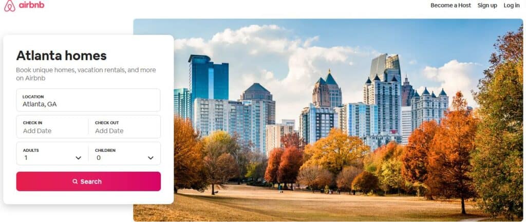
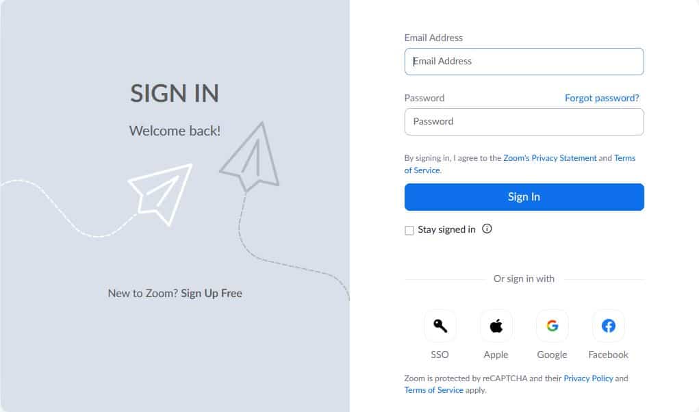
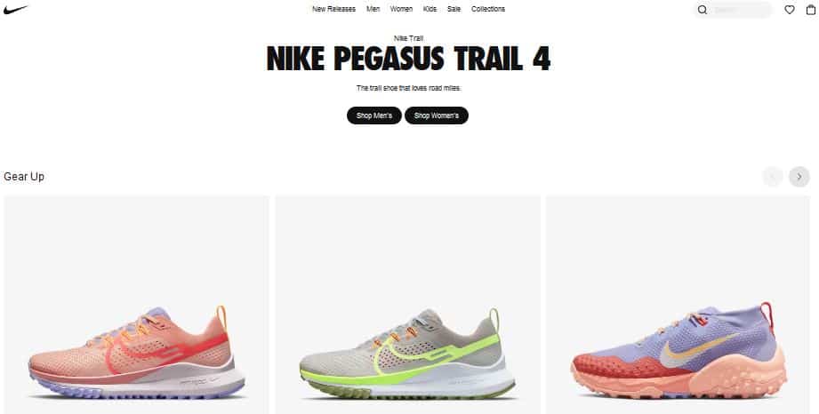
A call to action on website design is an important factor that affects how the target audience moves through your digital ecosystem.
In inbound marketing and B2B marketing, it is common to have a call to action (CTA) that encourage a visitor to download content. For e.g., an e-book, a white paper, or a guide.
But it can also be about registering for a webinar or subscribing to your blog. With a CTA, we want to get the visitor to take the next step and perform a certain action.
In this article, I will go through different types of CTA. I will also give you tips on how to write a call to action that get your visitors to take action and show you how they can be used on your website.
What Is A ‘Call To Action’?
A call to action means prompting your website visitors to take action. It is often by clicking a button, a link, or filling out a form.
Call-to-action, or CTA, is an important part of a website, advertisement, or digital content. It is supposed to capture people’s attention and get them to perform an action.
In digital marketing, a call to action on website design helps to convert a visitor or reader into a lead for the sales team.
A CTA can have different types of events depending on the purpose and goals. It is also available in different variants depending on the type of content and the target group they are to influence.
I will get into more detail on each of them later in the article but here are the most common types:
- Call to action links/ texts
- Call to action buttons
- Image banners
- Video banners
Why Is A CTA Needed?
A CTA on your site is used to help the visitor understand what happens next and to take the necessary step.
Most of your visitors may not be doing what you want them to do. They might decide not to return back to your website and the reasons for that can be many. It could be because they do not find what they were looking for or because they were distracted by something.
To reduce the number of interruptions, you can guide and urge your visitors to take the next step. This is where your call to action on website design comes in handy. An invite to subscribe to the newsletter is an example of a regular CTA on the web.
When it comes to CTA in ads, they are of course incredibly important for the results of your ad. If the visitor does not understand what to do or feels discouraged to take action, the result will be low engagement.

A Good Call To Action Makes It Easy For The Visitor
There are certain aspects that you should think about when you are designing your CTA:
- Who is the recipient of your message? Is there anything you can clarify so that the recipient immediately understands what it is you are asking them to do?
- What is the purpose or goal? Why should they click on your CTA? It is important that you highlight the benefits – what’s in it for them to perform the action. Also, you need to set the right expectations for what would happen after they click the button.
- Where is the recipient in their buyer’s journey? Have they come in contact with your brand before? Are they perhaps visitors that you should convert into sales-qualified leads?
- Where will your CTA be located? What environment should your CTA fit into? What type of content is there around that can distract them and how do you get their attention?
Also remember to keep the same tone, color, and shape so that the recipient recognizes them in your brand, or in the campaign/ project.

Using Several Different CTAs
It can be tempting to put several different CTAs on your website to help the visitors. But it should be done with caution since you risk making the experience worse.
The reason for this is that the visitor feels pressured to make a choice instead of following a natural progression. You can also cause decision-making anxiety by presenting several different choices or prompts on the same webpage. So, try to steer everything towards the same click event and goals.
In certain cases, it may be appropriate to have several CTAs.
For example, there could be CTAs for:
- subscribing to the blog
- contacting your company
- reading an article
On a landing page, it is a good idea to get the visitor to click to download a guide. In general, you should limit the number of decisions that need to be made and simplify the process for your visitors so that the choice feels natural and obvious.

Place Your CTAs At The Right Location
Although you should be careful about how many prompts you have on a page, you can still use the same CTA in multiple locations. Just remember not to confuse the user by displaying different CTAs around the same location.
Place your call-to-action in places that feel natural to your visitor. For example, in a sidebar, after the introduction, or at the bottom of a page when the visitor has finished reading the content and is ready for the next step.
By placing your CTAs in different places on the page, you can get valuable information about which CTAs your visitors actually click.
Keep in mind that many people today visit websites using their phones. Therefore, do not use images that are too wide or fonts that are too big.
Just make sure that they look good in narrower formats as well. It will be best if you can create a mobile-responsive layout for these visitors, where the call to action buttons also have different formats to adjust according to the screen size.
Create A CTA That Stands Out
It is obvious that your call to action buttons should be visible. A common mistake is to use a button with color or size that is not conspicuous.
A gray button looks inactive. As a result, the visitor may not pay attention to the CTA and could leave your page without thinking about the next step.
It is crucial that your CTA stands out from other design elements on the page.
Feel free to use a color that has a high contrast to the context in which your button or image is presented. You should follow your company’s design profile. But it is a good idea to use an accent or contrasting color for your CTA so that it catches the visitor’s attention.
Also, keep in mind that the CTA should “feel” like a button. If you hover the mouse over the button, it should show that it can be clicked. This could be achieved through a light animation, change of color, or using shadow.

Make Sure Your Call To Action On Website Is Relevant
Get to know your website visitors. If you work with B2B products or services, your visitors normally have a much longer decision-making process than consumer-oriented and eCommerce websites. Therefore, think about where your visitor is in terms of the purchase process.
If the page the visitor is on is about your products or services, chances are that they are looking for a solution. They are ready to take the next step to compare products or make a purchase.
However, if they are looking for inspiration and visiting your blog for the first time, you may want to guide them towards content that will help them solve a common problem.
Presenting the right CTA to the right person in the right context is an art. But it’s crucial for running a successful online business, especially when it comes to lead generation and B2B marketing.
Change Focus From “My” To “Your”
Addressing the visitor with “Your” is an effective way strategy in writing CTAs that encourages clicking. This is because it indicates that what is going to happen belongs to them.
Here are some examples of where this could be applied:
- Download Your Guide
- Register Your Account
- Reserve Your Spot For The Webinar
Imagine if you had changed “Your” to “My”? Which CTA would you have preferred to click?


