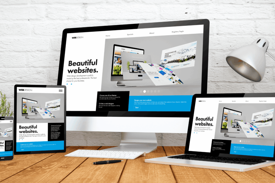
There are a variety of web design layout guidelines to consider before you begin development. This article covers 6 best practices for designing a website so that you can increase its efficiency.
Today, a website can be created and made operational in a matter of minutes. However, there is a difference between a well-optimized website versus one that has just gone live.
Why is design an important factor? People form opinions about a site in less than 50 milliseconds. Yes, that’s what it takes for someone to be impressed or turned away by your site. Most of this judgment is based on the design.
Conversions, reputation, and, eventually, the popularity of your site are all influenced by website design. There is no such thing as a perfect website, but you can follow the web design best practices in optimizing it as much as you can.
Here’s something else to think about: 88% of customers are unlikely to return to a website after a negative experience. Furthermore, 70% of agencies believe that their clients’ most important weakness is bad website design.
The bottom line is that if you don’t build your web page considering the user experience, it will hurt your company. That is why I created this article.
Best Practices For Designing A Website
1. Keep Text To A Minimum
Use small blocks of text instead of filling your pages with larger blocks.
I’m not referring to blog posts, which must sometimes go into detail. I’m referring to your website pages (e.g., landing page, homepage). Reduce the text in these areas.
You want your site visitors to know everything they need to know about your business, your products, and your brand. However, you must learn to say your story in a few words or even a few sentences.
2. Make It Visually Appealing
Visuals are not only useful for breaking up your textual content, but they are also helpful in explaining things in detail. Show your audience who you are and what you’re all about. They’ll grasp more information quickly in this manner.
These web design best practices are embodied on Dollar Shave Club’s product pages.
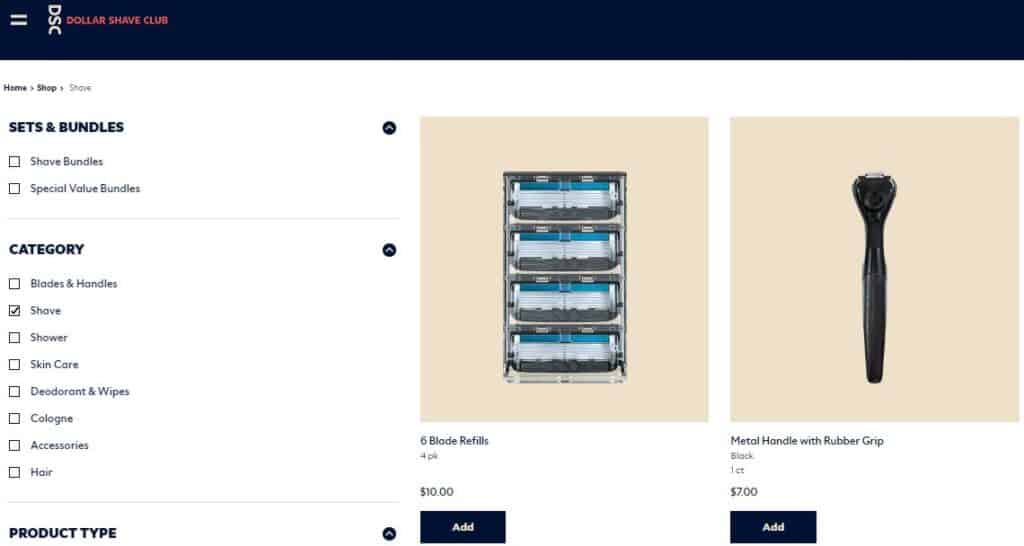
Let’s assume that your website sells men’s razors, shaving cream, blades, and other skin care items.
You run a subscription-based company and send these items to your subscribers once a month. Your razors have a really nice design; they’re made of special hardwood and look like perfect gift items.
Instead of getting into all the details on the homepage, have a picture of these items with text along the lines of “delivery to your doorstep.” In just 4 words, you can convey your message.
Sure, as the visitor progresses through your pages, you can get into more details, but a long text summary isn’t needed.
3. Work With Short Paragraphs
Take advantage of paragraph breaks. Longer paragraphs are fine, but I prefer to limit the paragraph in my blog articles to a few sentences.
Try not to go overboard with this principle. Too much of something is never a good thing.
Each paragraph should begin with something new so that people scrolling can easily see if they have to go through that paragraph.
By removing needless text from your pages, you will reduce clutter while still emphasizing your CTA.
It’s more effective to have the CTA in a separate paragraph rather than fitting it within a sea of text.
Bullets are a valuable tool in most cases. Try using lists instead of long-form text and adding more paragraphs. Add bullet points to these lists.
According to studies, people are more likely to look at bulleted lists than other forms of text. This is because they increase the scannability of a page and let you highlight the important aspects.
4. Use Shorter Lines
It’s easier to comprehend short sentences.
Don’t overwhelm visitors with large blocks of text. They’ll be confused as to where to begin reading and won’t be interested in consuming your content.
You can change it up a bit. If a longer sentence is needed, it can be followed by a shorter one. It is nice to have a variety.
5. Make The Call To Action Evident
It is a good idea to make the CTAs stand out. They must not be buried in a bunch of text and should be big and bold so that the visitors know the next step.
However, most websites lack a call to action that can be identified in under three seconds. There’s a fair chance that you are one among those who take longer. If that is the case, it is something that you need to fix right away.
Without an appropriate CTA button, you won’t be able to drive conversions.
It is common not to find a call to action on a company’s internal pages (where you describe what your company does and the services or products you offer). It is a serious flaw in the design. You can’t expect your audience to return to the homepage in order to take action and convert.
Consider this CTA on Mailchimp’s website:
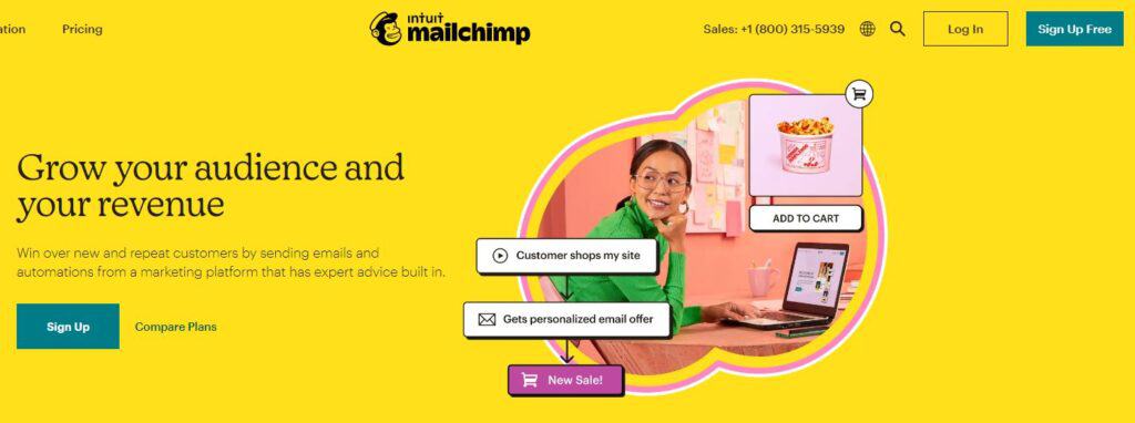
Take a look at how straightforward and intuitive the design is. The message is obvious despite the lack of too much textual content on the homepage.
The “sign up free” CTA stands out as a result. Mailchimp also placed it in a number of locations on the page.
The location of your CTA can vary depending on the page. For instance, the CTA should be prominently displayed at the top of the blog post so that readers can see it easily, as well as at the end of the post.
6. Pick Colors That Are Consistent With Your Brand
Your website’s color choices are more crucial than you may think.
As stated earlier, in less than a second, visitors form an opinion about your website. The majority of this is due to the colors you pick.
Being consistent with your brand is the easiest way to select a color scheme for your website design guidelines. Refer to the company’s logo. Are the colors on the website consistent with the image you want to project?
Let’s take a look at an example. Consider McDonald’s.
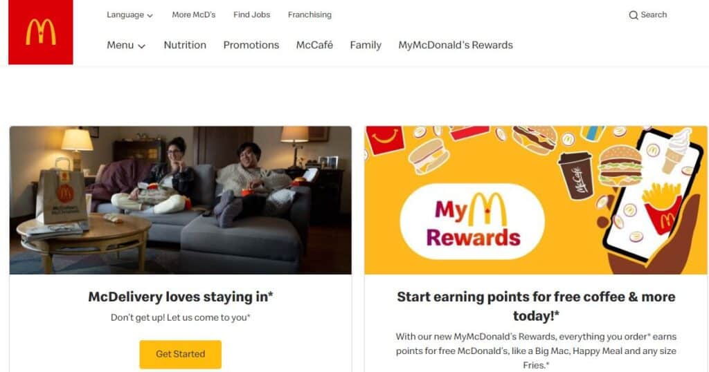
I’m sure you have a picture in your mind when you think about this brand. It may be a sign, a logo, or the location of a store.
Do you have any colors in mind when you think of that name? Let’s take a peek at their homepage now.
It’s not surprising that they have chosen a red and yellow color scheme.
This design decision is consistent with their brand image and logo, reinforcing what customers already know about the company. By keeping everything consistent, they avoid any uncertainty. It would have been strange if the colors on this website were green and brown. That is not related to their brand.