Everyone’s website could be better. Use the checklist for web design from this article as a reference to assist you in making such changes. Whether you have just launched your website, or it has been operational for several years, you need to consider the principles of a good website design.
To say that a website’s design is important is an understatement. A website’s success is largely determined by the design choices that you make.
Don’t worry too much about the details. I’m not suggesting that you implement all these design ideas right away, but you should start somewhere. The concepts and ideas in this guide are backed up by design-related analysis and statistics.
Always keep in mind that a website can be improved over time. You’ll gain an advantage over your competitors if you commit to it and consistently work towards refining your website.
Principles Of A Good Website Design
A website user should be able to easily locate what they’re searching for on the website.
Consider how you would feel if you were in their position. What brings you to the website? How do you go about completing the task? Perhaps you’d like to purchase something, learn more, or see what’s available. Regardless of the reason for the visit, if your audience can’t find what they are looking for easily, they’ll leave.
There are just so many options in the marketplace. There’s no need for users to deal with the complex website navigation process. They’ll just leave your website and look for what they want elsewhere.
Don’t make it difficult with a convoluted website design layout. Stick to the basic web design format.
For instance, the navigation menu is usually placed horizontally near the header on most websites. Your visitors would be confused if the menu is located elsewhere.
Examples Of A Good Website Design
Take a peek at Stripe’s website.
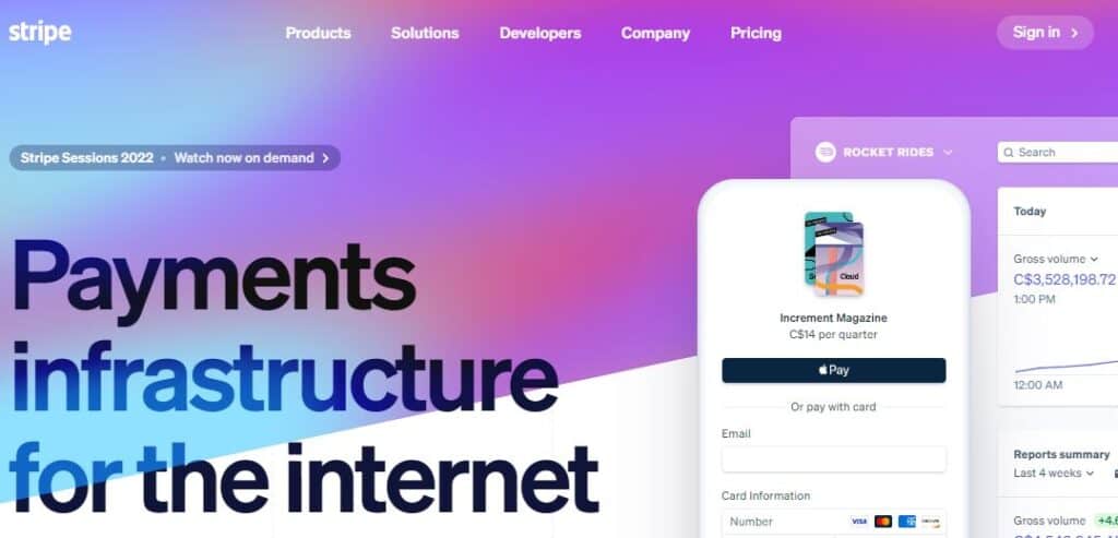
It follows a simple website design layout. There are few options on the menu. This allows visitors to quickly find an option that meets their requirements.
You’ll note that there’s little text on the page and that the call to action is bold and visible.
This web design principle reduces the chances of visitors getting lost or confused while browsing the website.
If your website has many selection options like an eCommerce store, you can include a search bar to make browsing easier instead of using a complex menu. Rather than having a separate tab for each feature, many tech companies group their features into a single features tab.
The more choices your visitors are presented with, the more time it will take for them to reach a decision. As a result, the conversion rates would be lower if you use complex navigation and web design for websites.
Web Design Principle – Hick’s Law
The fewer the menu options, the better. Or else, people would have a difficult time finding what they want. This principle forms the basis of Hick’s law.
The jam experiment, a well-known study that explores the paradox of choice, is a good example of this.
The experiment was carried out in a local food market. On one day, consumers were given 24 different jams to try, and the next day, they were given only given 6 types:
- On the first day, the big display table generated 60% more interest, but just 3% of them bought jams.
- On the second day, the smaller display with 6 jams drew 40% of visitors, but 30% of them bought jams.
Conversions were 10 times higher when options were limited. This principle is relevant when it comes to the navigation of your website.
Remove any menu options that aren’t required. For instance, instead of using a “home” icon to return to the homepage, visitors can click on the website logo to get there.
2. Use Familiarity To Reinforce Behavior
If your messaging is similar across all pages, your call to action should be consistent as well.
Consider how visitors interact with your website. Although you may have a specific flow in place, not everyone will visit a page and subscribe right away. They may take a look around first.
Let’s say you run an eCommerce store. You don’t want to be inconsistent with your CTA buttons on the pages, as shown below:
- Landing page: Redeem this offer today
- Homepage: Get this offer now
- Product page: Click to buy
There is no reinforcement if the visitor sees these different CTA buttons on the homepage, landing page, and product page.
Instead, stick to a predictable style and messaging. Here’s an example from the Walmart website.
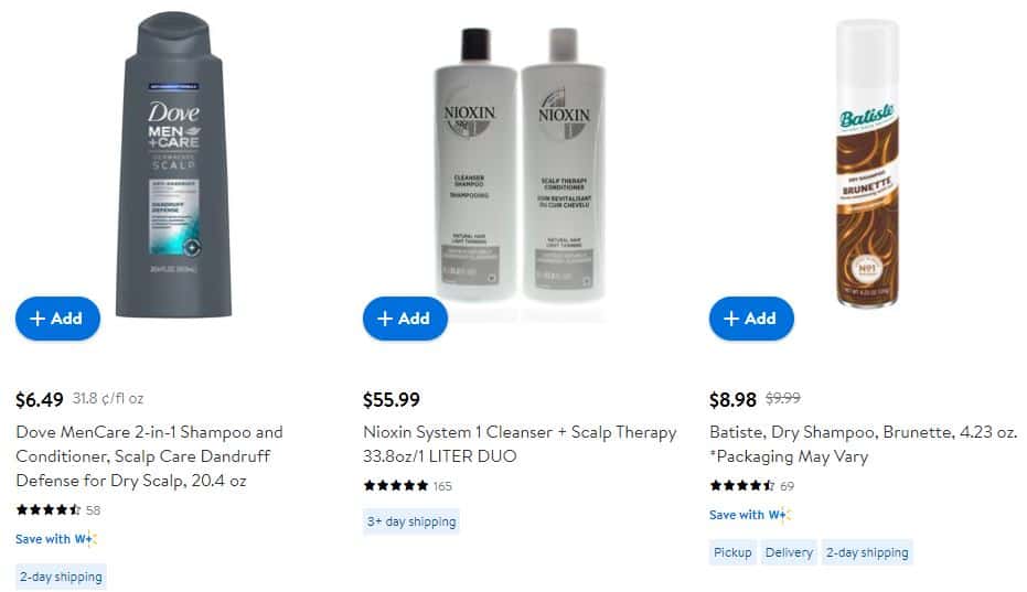
It makes no difference if you’re on their electronics, books, or health pages. For their items, you’ll see the identical “Add” CTA.
Every page also adheres to the overall minimalist, blue-and-white style of their website.
This design theory can also be applied to your site.
It’s more than just the call-to-action button. The goal is to apply this form of reinforcement to as many components as possible.
Consistency in the messaging, design element, and theme helps with brand recognition and leaves a good impact on your audience.
3. Make SEO A Top Priority
Any changes you make on your website should take SEO into account.
It’s not just about adding a few keywords randomly. It’s a framework for enhancing content across your entire website and aggressively targeting specific topics in order to establish your site’s relevance and credibility.
For instance, a web page for an eCommerce store should consider on-page optimization factors such as:
- Headline: It is often the main text on the page. As a result, it should be optimized on the page
- Relevant keywords: The key phrases and terms the pages are related to
- Mobile-friendly: The appearance and functionality of your website on a smartphone
- User experience: How simple it is for your audience to navigate through your website
- Internal linking: How you connect to different pages on the site
Website Design Tip – Create A Sitemap
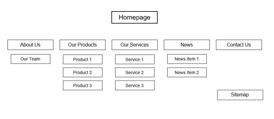
Create a sitemap XML. This helps the search engine to read and index your website’s content. The sitemap will show the crawlers:
- when they were last updated
- where the pages on the website are located
- how they relate to the other pages on the website
- how often they are updated
A properly put-together sitemap helps Google understand that your website does not include duplicate content that can lower the SEO rankings.
Other Aspects Of Web Design Processes
There are several less obvious factors that play a role in Google ranking for websites.
We’ve already discussed a few elements on the page that can be improved. However, there are other aspects to think about:
- Quality: Visitors should find your website useful. The ‘About’ and ‘Contact’ page needs special attention. Other aspects include: how often you update the site, how simple it is to access your pages, uptime (frequency at which the website crashes), and HTTPS encryption.
- Domain: The URL has a major impact on your Google ranking. The presence of the target keyword in your domain and the age of the domain matter. The domain extension is also an important consideration (e.g. high-quality extensions like .com, .gov, .net, .org vs unconventional types).
- Backlinks. This refers to the type of websites that link to your website. It is an important factor in achieving a high Google score. The number of pages linking to you, the authority and quality of the sites connecting to you, the anchor text used for linking, and whether those links are from .gov or .edu domains are all key factors.
4. Make Your Design Mobile-Friendly
A growing number of the world’s internet users use mobile devices to access the Internet. This means that if your website isn’t mobile-friendly, it won’t do well.
Search engines are aware of this and recognize mobile-friendly websites. Here are some more statistics to emphasize the point:
- A smartphone is used to conduct more than 50% of all searches on Google
- According to Google, 87% of mobile device owners perform an online search at least once a day
- 70% of Google’s first-page search results are optimized for mobile visitors

One of the most effective website design steps you can take to improve your Google ranking is to focus on mobile SEO.
People wouldn’t stay on your website if it can’t be viewed properly on their smartphone. As a result, put some effort into making your website design responsive.
Take a step further: Do you want more tips on how to make your website mobile-friendly? Take a look at our comprehensive guide to creating a website optimized for mobile devices.
5. Do A/B Tests On A Regular Basis
You can’t follow a set and forget strategy when it comes to web design for websites.
As I mentioned previously, no site is perfect. You can always make improvements to your website design layout.
That is why A/B testing is essential. It lets you make frequent changes to your site and try out different ideas to find out what works well and, also, what doesn’t.
Almost every aspect of your site’s design can be put to the test. You might, for example, create two separate landing pages with different calls to action but otherwise identical content. If one page converts more than the other, you can be certain that its call to action is working.
Here are a few pointers to keep in mind when running A/B tests:
- Experiment with the color of the button
- Make sure your call-to-action button is in the right location
- Run a test on the images you’re using on your landing pages
- Make sure the copy of the CTA is right
- Make sure the navigation bar is of the right size
- Experiment with different text variations on the page
6. Increase The Site Speed
You may be wondering why page load time matters when it comes to website design principles.
The load time depends on your website host, traffic, server, and similar factors. But your design choice also has an effect on the speed of the website.
Your loading times can be affected each time you add something to your website, especially videos, images, and other types of media files. As a result, HTTP requests could be slowed down.
High abandonment rates are caused by slow loading times. This is something you can’t ignore. It will affect your business if your web pages take a long time to load.
Additionally, 1 in 2 visitors leave sites that take longer than 6 seconds to load. That is the time that you have to avoid losing 50 out of every 100 visitors. Most users expect a page needs to load in 3 seconds or less.
So, how do you put this into practice for implementing a good web design?
- Use browser caching features to your advantage
- Make the image file size smaller
- combine and minify the files
- Boost the time to first byte (TTFB)
- Minimize HTTP requests
There are several resources available online to assist you in completing these tasks. Check out the WP Rocket plugin for combining and minifying your files. Also, if you make design improvements to your website, use Google’s PageSpeed Insights tool to test your loading times.