We will go through the best font for websites in various industries so that you can pick one that is suitable for your business.
A great website design has a lot of different elements. However, I often find people overlooking small details such as typography.
You could be wondering – how important is the font on a website?
As strange as it may seem, something as basic as font selection can cause a significant effect on conversion. Furthermore, website fonts influence the overall aesthetics of your website.
It’s rare that you’ve visited a site and thought, “Oh I’m in love with this font!”
It isn’t something our brains are wired to pay attention to, and I don’t expect you to come up with a font that will “wow” your site visitors. However, I’m sure you’ve visited websites with fonts that were bland, unattractive, difficult to follow, or seemed to be a misfit. Obviously, you don’t want the visitors to think that about your website.
Significance Of Fonts
Consider this factor: different fonts can alter the reader’s perception of a given subject.
A documentary filmmaker, Errol Morris conducted a survey. He quoted a section from a book claiming that we live during a period of unparalleled safety, and then asked two questions: whether the assertion was correct and how sure people felt about their answer.
Morris, it turned out, was not concerned about what others thought. He was just curious to find out if the font had any impact on their responses. Unbeknownst to them, 40,000 participants took part in this experiment. Even though everybody read the passage, they didn’t all view it in the same font.
Morris observed those respondents who had agreed to the initial question. A weighted value was assigned to each answer based on their level of trust in the second question.
As a result, it’s obvious that people’s trust in concurring with the statements being made differed depending on the website font they were shown in.
Morris also looked at the results of those who disagreed with the claims. The Baskerville font came out to be the lowest rank for weighted disagreement and the highest for weighted agreement. In terms of the weighted agreement, Comic Sans came in last, although in terms of weighted disagreement, it came in first.
Morris inferred from this data that fonts can affect how people interpret information. As a matter of fact, the font you choose can influence your website’s credibility.
In a nutshell, website fonts do matter.
Best Website Fonts In 2026
- Montserrat & Playfair Display – Best font for websites in the fashion industry
- Lato & Merriweather – Best website fonts for the homepage
- Roboto & Open Sans – Best font for headline
- PT Sans & PT Sans Narrow – Best font for a website with blog articles
- Raleway & Cinzel – Best font for a website in the food industry
- Alegreya & Lora – Best font for websites to caption images
- Josefin Slab & Amatic SC – Best website font family for designers
It’s better not to use the same font all over your website because it’s too boring. Change it up! However, make sure that the fonts you choose complement each other. This guide was written to assist you in doing that.
Perhaps, there are a lot of places to find free fonts. My favorite is Google Fonts. The best Google Fonts have been listed. So, take a look at the list and see which combinations work better for your site.
1. Montserrat & Playfair Display – Best Font For Websites In The Fashion Industry
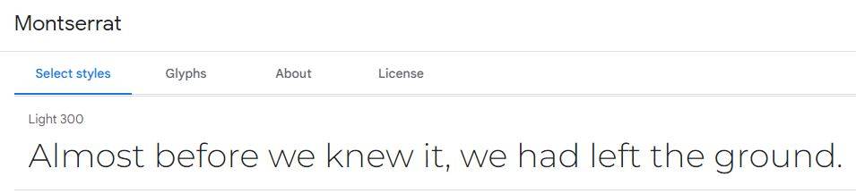
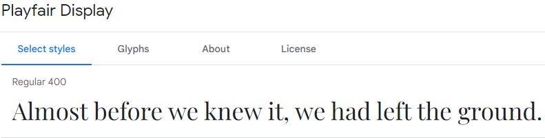
This combination of fonts is best for website text that isn’t too long. It’s not something I’d use in a blog article or something similar.
This pairing, on the other hand, is ideal for the title and description of a product, particularly in fashion-related eCommerce stores. The lighter font, such as Montserrat light, provides a level of sophistication to the text, which is appropriate for luxury brands.
Interestingly, swapping the two and using Montserrat for the header transforms the persona into something techy or futuristic. If you are trying to promote a game or even using a landing page for a mobile gaming app, the combination can work well.
In any case, both the fonts complement each other. Your selection would depend on the overall theme and message you want to convey on your site.
2. Lato & Merriweather – Best Website Fonts For The Homepage
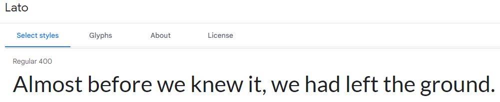
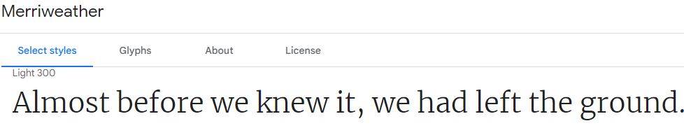
The pairing of Lato regular and Merriweather light looks very professional and clear.
Since these fonts are so versatile, they are a common choice. Merriweather variations are modern, attractive, and stylish fonts. When it’s accompanied by text in Lato, the combination comes across as trustworthy.
On your homepage, I suggest using this mix. This text combination will work well if you have a template that requires scrolling to find out more information. Imagine a website user scrolling through your home page and seeing a picture on the left and this font pairing on the right. On further scrolling, the next picture is present on the right, and the text on the left.
If your current design looks like this, you can certainly use this pairing to give your content a professional feel.
3. Roboto & Open Sans – Best Font For Headline
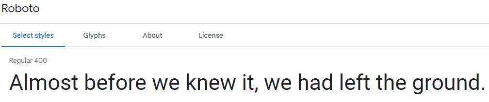
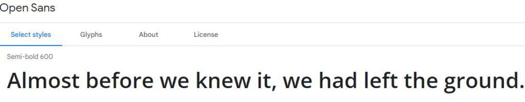
This header with semi-bold Open Sans and the text below in regular Roboto is a good combination. The semi-bold header adds a little more flair compared to the regular Open Sans, but either option should work well.
The fact that these fonts are both sharp and quite legible is one of the reasons why they fit so well together.
For your site design, you have a variety of options to consider. On your homepage, this combination may be applied to point out your value proposition. The header with Open Sans can be used to draw attention to the subject. Then use Roboto to expand on it.
If you change the fonts around, they work as well. The header could be Roboto and the paragraph with Open Sans. In this case, Open Sans regular and Roboto medium are the best choices.
4. PT Sans & PT Sans Narrow – Best Font For A Website With Blog Articles
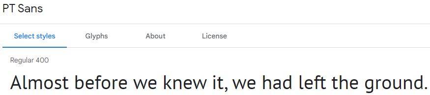
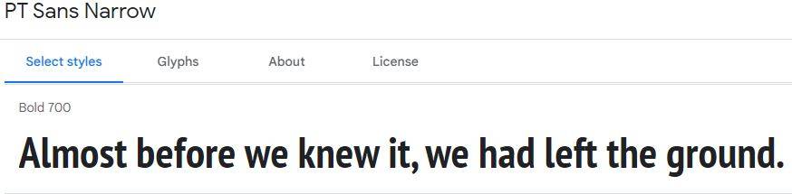
The combination of PT Sans and PT Sans Narrow is a classic. This versatile option is suitable for almost any website.
Since the fonts are easily readable, they can be used for both short content and long-formats like blog articles.
These fonts appeal to me because they are legible but not bland and boring. Consider using PT Sans and PT Sans Narrow on homepages and landing pages.
5. Raleway & Cinzel – Best Font For A Website In The Food Industry
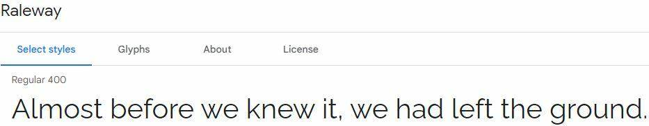
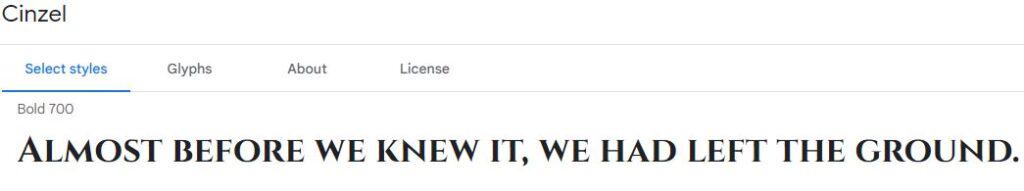
Cinzel is a weighted typography. Since it’s completely capital letters, it’s better suited to short text than lengthy blog articles or similar content.
It’s well complemented by a font like Raleway, which is a little more traditional. Both the fonts are ideal for food and beverage-related websites.
This is something you might use to spruce up your menu online. The categories of the menu should be written in Cinzel black, the titles of meals using Cinzel bold, and the item description using regular Raleway.
If you want to stand out, you can change the two fonts and apply Cinzel for body text and Raleway for headings. This may be useful for local stores such as coffee shops that post weekly brews or specials on their website.
6. Alegreya & Lora – Best Font For Websites To Caption Images
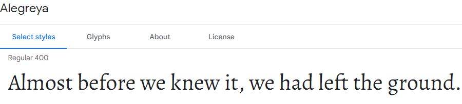
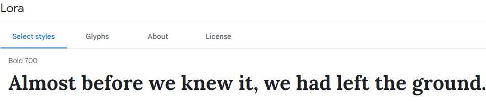
Lora bold is a powerful and legible font that works well for page titles. While the font is bold, it is still warm and welcoming.
Alegreya is a great complement to Lora, particularly when used to caption images.
Alegreya is legible but can get difficult for longer reading. This is why it’s best for short content such as brief descriptions or captions. I wouldn’t suggest trying out any other Alegreya variations. The legibility of this font is reduced when italics or weight are added.
When their positions are reversed Alegreya bold works perfectly for header and title text. Lora regular is readable, so it’s a good font for longer texts. In my opinion, this combo would be ideal for a brief case study or customer testimonial.
7. Josefin Slab & Amatic SC – Best Website Font Family For Designers
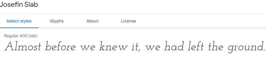
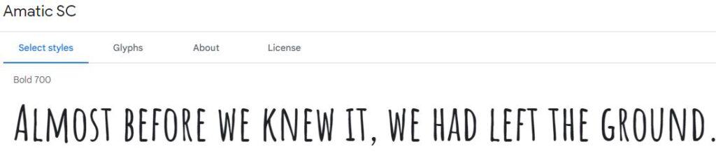
The combination of Josefin Slab italic and the Amatic SC bold is not for all. I wouldn’t recommend it for most web pages, but it’s a fantastic mix for artsy pages. These fonts should be applied sparingly on your website, whether you’re a painter, musician, or photographer.
The trick here is to leave enough space within the content. I think it looks best against very light or white backgrounds.
If you sell sculptures or ceramics, this font could really resonate with your audience and match well with the general theme of your website.
Just be careful not to overdo it. Excessive use of this font on the website is unattractive and difficult to read. On that note, go with other options for longer sections of text, like the about me or biography page.
How To Choose The Best Website Fonts
How can you choose the best font for a website, now that you’ve seen some of the top Google Fonts combinations?
The first step is to figure out what kind of content you will be working with using the font. Will the font be used on your homepage, blog, landing page, navigation menu, or product description?
You should also think about the business you have and the audience you’re trying to reach. Is it necessary to use a professional font? Or is there any leeway to be a little different?
Contrast is crucial when combining two fonts. The fonts should be distinct enough to be recognized, but not too distinct that the viewer is distracted.
On your website, you could try using a few font variations, but don’t overdo it. Maintain a straightforward approach. Only two or three fonts should be used on each page. If you would like more, use variants of the fonts that are already used on the website (italic, bold, light, medium, etc.).
Final Thoughts
Since fonts are so important, it’s time to ditch the default. A great option for free fonts is using Google Fonts.
Here are some of the best fonts in 2026:
- Montserrat & Playfair Display – Best font for websites in the fashion industry
- Lato & Merriweather – Best website fonts for the homepage
- Roboto & Open Sans – Best font for headline
- PT Sans & PT Sans Narrow – Best font for a website with blog articles
- Raleway & Cinzel – Best font for a website in the food industry
- Alegreya & Lora – Best font for websites to caption images
- Josefin Slab & Amatic SC – Best website font family for designers
I made an effort to compile options that could work for anyone. However, not every website can work with all of these fonts. So, go through the list and decide which fonts are suitable for your business, target audience, theme, and industry.