A successful landing page grabs the attention of your visitors and converts them into leads. In this article, I’m going to share with you some tips on how to optimize landing pages so that you can draw in more visitors and turn them into paying clients.
What Is Landing Page Optimization?
The act of improving each component of the landing page in order to enhance conversions is known as landing page optimization. You use anecdotal evidence and data rather than redoing the entire page based simply on a gut feeling.
You may gather data before the landing page is published. This way, you get a better understanding of what your audience wants and expects, for example, by surveying them.
You won’t, however, be able to create the ideal landing page right away. Instead, you need to make adjustments as you go by evaluating the data points and tracking the conversion rate.
Determine Any Potential Issues Before You Optimize Landing Pages
There are some marketers that employ ineffective landing page strategies. They try to change everything thinking that there is a problem.
This is similar to throwing mud against the wall to see what sticks.
You shouldn’t work on landing page optimization in that manner. In order to address the specific issues contributing to lower conversion rates, you must first identify them.
You can see how people are behaving on the landing page by using a heat map. Do they disregard your CTA? Are they spending time on an irrelevant component, like a stock image?
Find out where in the heatmap are users having the most activity. Put the most crucial component there and see whether it generates more clicks.
Monitor the behavior of your website’s visitors to determine what isn’t functioning.
Not only heat maps but other data visualization reports can be useful for optimizing landing pages. Informational tools include confetti maps, scroll maps, list reports, and overlay reports.
Scrolling activity is indicated by the scroll map. The map will show a lot of blue or white if visitors have either quickly scrolled past that area or have abandoned the page. Areas that are red, orange, or yellow show that visitors have paused to look or read.
List and overlay reports show you the specific numerical data and percentage of clicks on different page elements, respectively. Confetti reports give you a visual representation of where specific clicks have happened on the page.
14 Best Practices For Landing Page Design & Conversion Rate Optimization
Follow best practices and use solid data to optimize your landing pages if you are looking to increase conversion rates. The process begins as soon as you start designing the landing page for lead generation, and it continues even after the page is published.
Consider it similar to creating a product. The ideal prototype is not created on the first attempt. Instead, before the product is perfected, you might go through several different iterations.
Landing pages are created in a similar manner. Much like products, landing pages should entice your target market, fulfill their expectations, and motivate them to take action.
1. Keep The Landing Page Simple
A very straightforward landing page eliminates visual clutter. Your call to action is where you want to direct your visitors.
Square is a great example. They make fantastic landing pages and say a lot in a few words.
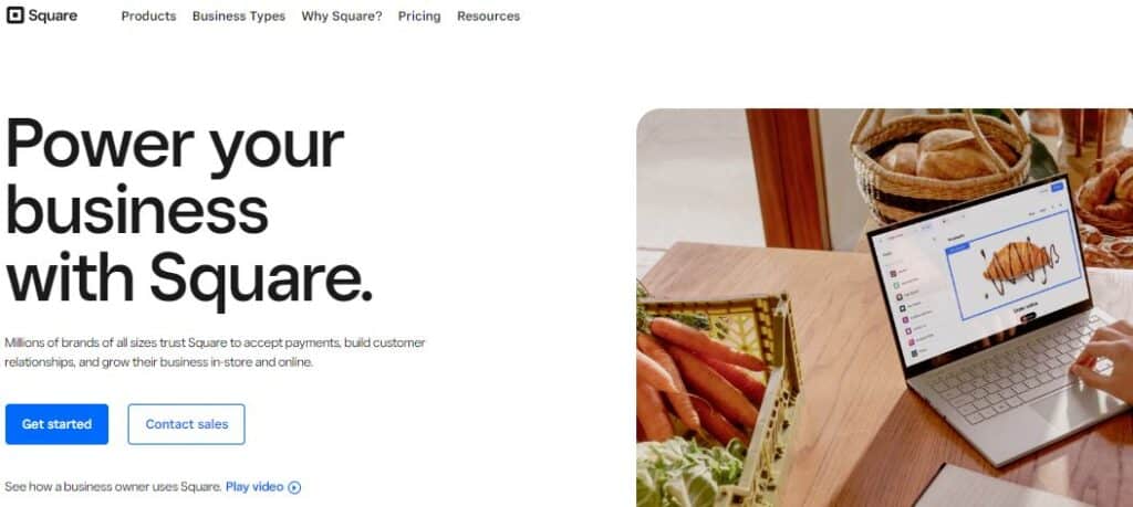
There are just a few main components above the fold on this page, and they are small enough to go into the space provided by the navigation bar. There is a subtle image to the right, and the page emphasizes the call to action.
2. Clearly State Your Offer
According to marketing guru Seth Godin, ” A brand is the set of expectations, memories, stories, and relationships that, taken together, account for a consumer’s decision to choose one product or service over another.”
If you are trying to increase your conversion, use this knowledge to your advantage.
When you are first developing your optimization approach, consider what you can do to make the customer feel good. They should be informed, valued, motivated, and enthusiastic.
Consider the exact objective of your target audience before creating a headline. Here is an example from Slack:
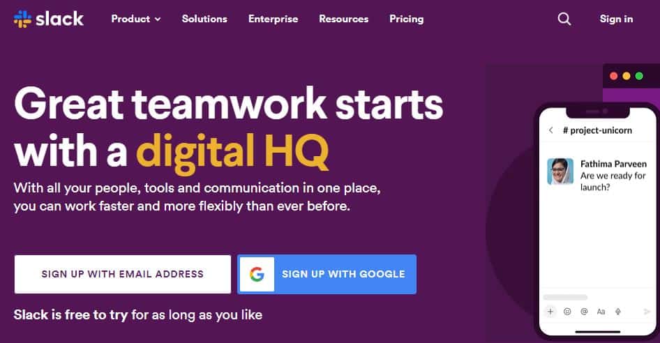
In this context, the word “faster” and “flexibly” makes the customer feel like they should experience it.
3. Place The Crucial Information Above The Fold
The phrase “above the fold” was used to refer to the placement of ads in the newspaper. To encourage readers to buy the paper after seeing the headlines, the most interesting stories were published above the standard newspaper fold of the front page.
You may achieve the same result by placing the elements of the landing page above the digital fold, or the section at which a visitor needs to scroll to see more content. Since more people use their tablets and smartphones, this is becoming more challenging.
You are able to figure out the placement of the headline, a few sentences of copy, and the CTA by using a scroll map to quickly determine where the average fold appears on various screens.
4. Use Contrasting Colors
The contrast in color and clarity is used to great effect on the most effective landing pages. The CTA in this example from Evernote is hard to ignore.

Although the color of the logo on the left side is reflected in the “Sign up for free” button, it is quite clear and distinct. The headline and CTA stand out against the white background. Additionally, there is a lot of empty space between the components and text.
5. Make Sure Your CTAs Are Simple
A CTA button shouldn’t make the reader anxious or confused. Make the offer simple, direct, and easy to understand.
You’ll see that successful businesses avoid using flowery language or complex offers. Some examples of phrases are:
- Sign up for free
- Try for free
- Get started
- Join now
Simple, yes? And very powerful.
6. Use Time Constraints
“Limited quantity” and “limited time” are some of the most popular marketing catchphrases for a reason. Visitors to your page are compelled to act immediately by the sense of scarcity because they fear missing out if they keep waiting.
Even big retailers use this strategy. I recently purchased an item from Amazon that I wanted to pick up at a local store. I looked up the availability, I found this:
When I noticed that only 8 were left in stock. I immediately clicked the “Add to Cart” button before it got sold out.

Create a limited-time deal or offer a freebie, like a guide, on your own website to get the same results.
A countdown timer can give scarcity a visual component. It provides a deadline for visitors to respond to an offer.
7. Try Different Copy And Headlines
In a world dominated by images and videos, the text is still important. Make sure you can capture the interest of your target market with what you write.
On the landing page, you should be A/B testing with different titles. Conduct A/B tests and make changes to the body copy to see how those components make a difference.
8. A/B Test Everything
Your data gets more accurate as you do more A/B tests. Every test should change just one variable, like the CTA.
If you modify several variables, you won’t be able to tell which one made a difference in conversion between the 2 variants.
After gathering data and getting to understand your target market, you can put what you’ve learned into practice with a new design and use A/B testing to confirm that it increased the conversion rate.
9. Include Your Contact Details
You can present the users with your contact information in many ways. Your landing page could include your email address, phone number, or a form to get in touch. Some companies like Zendesk provide links to their help centers.
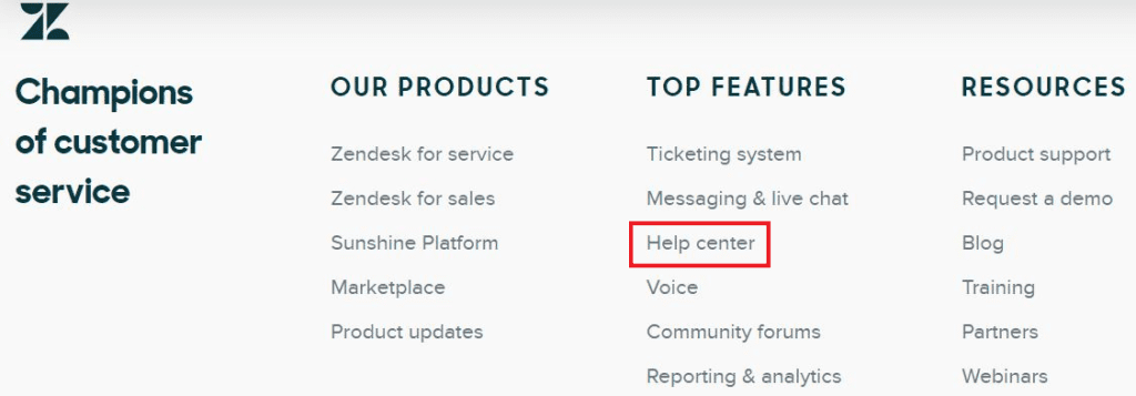
Customers understand that help centers contain contact information, responses to commonly asked issues, and tutorials.
10. Include Testimonials To Convert Visitors On The Fence
I really like social proof. People should be aware that other companies have purchased my products and used my services. In addition, I like to let them know that I was instrumental in their outstanding results.
One of the best options to go about this is through testimonials. You will have an advantage over the competition if you are able to get your clients to record a video testimonial. Quotes can also do the trick if you are able to provide the customer’s headshot and full name.
11. Maintain Consistency
While brand-consistent messaging is more crucial than ever before, conversion rates can also be greatly affected by visual consistency.
Consider that you run a Facebook advertisement that directs users to the landing page. You should make sure that the landing page reflects the text, images, and other components of your advertisement.
They need to have a similar appearance and show the same offer. If not, your prospect will become confused or frustrated.
12. Landing Page And SEO – How To Optimize Landing Page For SEO
Every day, people come across landing pages through organic search. Perhaps one of the landing pages serves as the home page, in which case it should appear when someone looks up the name of your business.
You could also achieve rankings for keywords associated with your industry. For instance, Airbnb is the top organic result when searching for “renting a cabin” on Google:

To choose the most appropriate terms for your landing page, use tools like Ahrefs. Use those keywords in the body text, picture alt text, headlines, and other places.
13. Short-Form vs Long-Form Landing Page Options
Some marketers think that short forms are more effective and asking for anything more than the email address is excessive.
But this is not always the case.
Long-form may be better if you need to qualify leads for a high-end product or service. Although you may receive fewer leads, they will be of higher quality.
For example, if you run a web design company, finding out the potential client’s budget can save you a lot of time. If the rate for your starter plan is $10,000, a client searching for a $1000 design is unlikely to use your services.
14. Use Exit Popups
When a visitor tries to leave your landing page, you could try implementing an exit popup to show on the screen. It gives an additional chance to generate a conversion.
They are less annoying than popups that start appearing when a person enters the site or just starts to browse.
To entice readers to click, use attractive visual graphics, a persuasive title, and a clear CTA text. Consider offering a special promo or other incentives in your exit popup.
You can develop A/B test variables as well as exit popups for certain pages on the website using a tool like Hello Bar. Aside from receiving a lot of helpful information, you’ll also learn how to encourage people to stick around using well-timed promotional offers.
Tools For Landing Page Optimization
Tools like Hotjar can be used to optimize landing pages and help to understand the behavior of visitors. For instance, you can see how someone navigates a page by watching a recording.
Watch their clicks, mouse movements, and other actions to determine what interests them and the aspects that turn them off. You can even watch them fill out forms.
Why Aren’t Visitors To The Landing Page Converting?
Landing pages do not convert for a variety of reasons. Quite often the root cause is an incorrect assumption about what the visitor wants. Conversion rates will suffer if you can’t meet the expectations or needs of your website visitors.
Landing Page Optimization Checklist
I’ve also observed the following issues while working with other clients:
- Poor headline
- Complex design
- Diversion from the main goal of the landing page
- Unclear call to action (CTA)
- Inconsistent copy between the ad and landing page
Keep in mind that it is hard to tell why your landing page isn’t converting without gathering data.
Good Conversion Rate For Landing Pages
The most effective landing pages have conversion rates of around 27.4%. The median values are substantially lower, with the majority of industries reporting conversion rates of between 2% to 6%.
The improvement of landing pages is what determines your success. If the conversion rates remain constant every month, you are probably not analyzing data and applying it to enhance the landing pages.
Website traffic and conversion rates are correlated. More people should convert as your website’s traffic increases, but this isn’t always the case.
But what if you’re receiving quality search traffic from Google but not getting conversions?
If there is a poor correlation between conversions and traffic, it means that the product, offer, or landing page process is ineffective.
- Product: The thing you’re selling isn’t appealing enough to make people want to buy it.
- Offer: Your audience doesn’t connect with the “hook” you’re using to get visitors to convert.
- Landing page: For some reason, readers are turned off by the layout, structure, images, or other elements of the landing page.
Optimizing landing pages will be easier if you can identify the issue.
Conclusion
The following are the top 14 best practices for landing pages to increase conversion rates:
- Keep the landing page simple
- Clearly state your offer
- Place the crucial information above the fold
- Use contrasting colors
- Make sure your CTAs are simple
- Use time constraints
- Try different copy and headlines
- A/B test everything
- Include your contact details
- Include testimonials to convert visitors on the fence
- Maintain consistency
- Make the landing page SEO-friendly
- Short form vs long form
- Use exit popups
This blueprint will assist you in determining what appeals to your leads and prospects so that you can get them to take you up on the offers.
Remember that basing changes to your website’s design on actual visitor data can dramatically increase conversion rates. To learn more about your website users, if possible, use recordings and visual data reports.
You are in a strong position to outperform your competitors if you have these strategies in place.
