Friction points in business and marketing are aspects that push consumers away. In most cases, we are completely unaware of it.
There are many things we can do to motivate people to buy.
However, if we aren’t careful…
It could be counterproductive and push people away.
One of the main reasons why your leads are unable to move through your funnel is friction points.
What Is Friction Point?
Any variable, user behavior pattern, or website quality that slows (or completely stops) the progression of your business’s sales cycle is referred to as friction.
Even minor details on your website can cause friction.
The following are some common points of friction and how you can avoid them in your business:
Friction Points Examples
Confused Audience
When your ads, marketing messages, and landing pages don’t make sense, you’ll leave your audience in a confused state of mind.
Keep in mind that the core of online marketing is the way different elements are put together. All the theme, copy, images, product descriptions, and long-form content should fit in seamlessly. But in the real world, that’s not always the case.
It’s quite challenging to engage with an audience. We’re always trying to promote something. There’s a risk that what you say could be misinterpreted by your audience.
If you’re a marketer trying to copy a competitor’s winning marketing tactics, you could end up losing. What is the reason for this? Your brand might have subtle differences which set it apart from others.
It’s possible that your brand’s tone, style, and personality are distinct. The values of your customer base can also vary.
Making your website easy to read will help your audience gain more clarity about your services. The truth is that the perception of each visitor is unique.
The viewpoint of a young graduate will be different from a middle-aged person. People are less likely to buy if they are having difficulty processing information.
Length Of The Web Page
The page length — that is, the amount of information and content to share with your audience — is a common source of friction.
When does friction happen?
When you share too little, you cause friction. Friction also occurs when you share too much. To effectively connect with your users, you must follow a balanced approach.
But marketers appear to lean towards the opposite ends of the continuum.
The trick to finding a happy medium is to test your web pages on a regular basis.
Take a look at this example, where a longer landing page performs really well. Pipedrive has a 7000-word article that drives a lot of visitors to the website for various keywords targeted towards their audience.
The longer page content worked better in this situation, resulting in a higher conversion rate. In other words, there was very little friction.
Let’s take a look at a different type of website.
Forbes publishes short articles that average below 1000 words. They focus more on publishing informative articles in a higher volume to increase their readership.
A long page can sometimes make people feel like your offer is too complex. On the contrary, a landing page that is very short can turn visitors away as it can make your business look untrustworthy or unprofessional.
How To Strike A Balance
Qualitative research (conducting surveys for feedback, interviewing prospects, talking to clients, and so on) will help you figure out what matters to people when deciding whether or not to do business with you.
Your homepage and landing pages should convey exactly what users need to know in the simplest possible way.
Write down the answer to what matters the most to your customers. Then distill your response into the simplest and most concise form possible.
Customers who need more information can visit the company’s knowledge hub, case studies, FAQs, and other detailed marketing materials.
What matters the most is that your homepage, landing pages, and sitemap make it easy for finding all the necessary information (instead of having it all squeezed into a single page that no one can follow).
Instincts
Consumers act based on their gut feeling. We like to think that we’re logical and motivated by conscious thoughts, but the reality is that our emotional brains are in control. Often, we aren’t even aware of it.
Friction occurs for reasons we can’t completely comprehend or justify — for reasons that are highly emotional in nature.
Logic alone would not be enough to impact your target audience. You must evoke an emotional response from your audience by appealing to their senses, instincts, and intuition.
That’s why so many companies spend so much money and time on aesthetics and creating a delightful experience.
When done correctly, delight is the most significant factor in reducing friction. Delight is about connecting the small details (as well as various aspects of your marketing strategy) to the bigger picture of your brand.
Here are 4 steps that I suggest for increasing the brand’s delight:
- Identify your values: What is important to your company? What do you have in common with your customers in terms of values?
- Understand the pain points of your customers: When brands add value to the lives of their customers, they become very successful. Learn everything you can about your target market. Think more like an analyst and pay attention to your audience.
- Brainstorm ideas: Now based on what you have identified in the previous two steps, come up with marketing ideas that will help you form the strongest possible bond with your prospects and customers. Consider strategies that result in trust, satisfaction and the establishment of an emotional connection.
- Monitor everything: It’s a popular marketing misconception that branding isn’t trackable.
Trustworthy
Why should customers have to trust your business? What distinguishes your company from the countless dishonest businesses out there that have repeatedly defrauded consumers, been subjected to cyber-threats, and simply failed to respect their customers?
Consumers have the following thought all the time… “Is this worth my time?”
And, to be frank, they have a point. It is the duty of the business to establish itself as a reliable and trustworthy brand.
Here are a few options that can help the business in establishing its credibility and value:
Accreditation And Security Badges
If you’ve been paying attention to the news, you’re probably aware that data protection is a top priority for consumers.
Consumers are reluctant to share their personal information such as credit card data online because cyber security breaches occur every now and then. The risks are too high to justify purchasing a $20 product from your e-commerce platform.
Consumers will feel that your brand is serious about security if you use trust and safety logos.
Accreditation, trust, and security logs can be placed on landing pages, near the website footer, or on the about pages of your website.
However, make sure they’re strategically positioned and visible when your customers are checking out. This way, you can increase the impact of these logos as much as possible.
Here is an example of a TRUSTe logo used by SalesForce in signing up for a free trial.
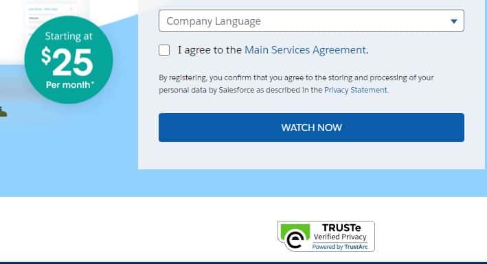
People who see the trust logos are less likely to abandon their sign-up process. These logos have the ability to boost the likelihood of a potential customer completing the form at a crucial point of the sales funnel.
Another example from LensDirect – a lens and eyewear store, demonstrates the security of all transactions:
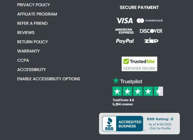
They have included multiple badges in their footer such as BBB accreditation, Trustpilot widget, and TrusteSite security logo.
Testimonials & Customer Reviews
Some customers have been screwed over by certain services and businesses in the past.
One way to build trust with your customers is to showcase the positive experience others have had with your services before.
Testimonials and ratings help to ease your customers’ fears and make them feel secure about what you’re selling. The reason for this is that today’s customer is independent and self-directed.
They’ve already made up their minds by the time they get to your website. Most of the time, they’re ready to buy before they contact a sales rep or fill out a lead generation form.
A Berkeley study indicated that a half-star improvement in a restaurant’s rating increased its chances of filling up during the peak hours by 30% to 49%. Readers will vote with their wallets if they like what they see in your reviews.
To justify the prices you charge consumers, you must establish a verifiable and stellar reputation.
Make every effort to personalize the testimonials and ratings by obtaining them straight from the sources. Explain why your business would save your customers money and time in a straightforward and convincing manner. Provide a high-level summary while also delving into the details.
However, keep in mind that your testimonials should be thoughtful and easily address your customers’ concerns.
Case Studies
ZenDesk’s testimonial page is both functional and appealing.
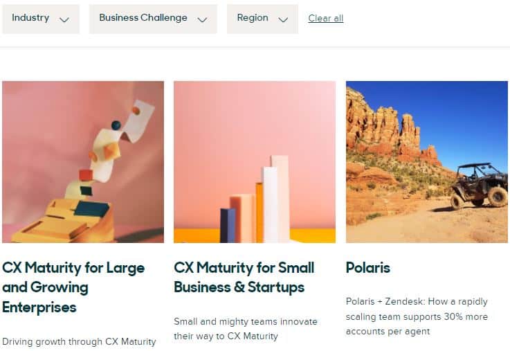
There is a menu to filter testimonials by industry, business challenge, and region. You can find thumbnails linked to the complete customer stories for a number of big-name brands.
This is a simple and straightforward technique to highlight their satisfied clients and provide prospects with the assurance they need before committing to them.
CodeAcademy is another great example. Their testimonial page does an excellent job of articulating their objective, and there are a number of students sharing their experiences.

They use videos to tell a story about how Codecademy helped their clients drastically change their careers by learning new skills.
The page then lists a number of additional students who have had similar results. You can click on each one to get a lengthy interview on how and why they became interested in coding.
This strategy of enlisting consumers as champions help those who are hesitant to enroll in a coding course overcome their fears.
Iterative Testing
We’ve almost reached the end of this guide and have explored different consumer psychology concepts.
Finally, particularly because we’re discussing friction, I’d like to stress the importance of running A/B tests to validate your assumptions.
The fact is that unless you’re actively studying your customers’ pain points, you’ll never know where the customer friction points are present.
Even Google Analytics data can be deceiving sometimes. For example, you could see that users are spending a few minutes on your website and think to yourself, “Wow, that’s a lot of user engagement.”
However, it’s quite possible that the customers are completely confused when they land on your website. A/B testing will help you observe patterns, reduce the customer friction point, and eliminate aspects of your conversion funnel that are creating blockages.
The next step is qualitative analysis, which entails talking to your customers to figure out why these scenarios are happening and how you can address them. You would also be able to make more informed decisions about copywriting, future design, and user interface experiences.
Follow the facts; the numbers don’t lie.
Conclusion
Along with leading people into the business’s conversion funnel, you must eliminate barriers that prevent them from advancing through the sales process.
Uncertainty and confusion cause friction. It’s much easier to close the window and visit another website than it is to take the time to really figure out what a company is trying to offer.
The best way to reduce friction is to keep it straightforward — don’t overwhelm your customers with details and respond directly to their questions. Create FAQs and knowledge hubs to provide more details to information-seeking visitors as needed.
Use trust badges, testimonials, and consumer feedback to build trust. Be clear about the source of the information. Be as transparent and truthful as possible. This information should be strategically placed so that consumers feel secure at critical decision-making points.
Constantly test and challenge your assumptions. Your company can conduct A/B tests and qualitative analyses on a regular basis. Trust the facts to help you make better decisions in the future.
